Tuesday, 26 January 2010

REVIEW: Editing final product


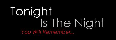
We made the changes that we found we didn't like in the first draft. We put the colour as red because we felt it represented the sense of warning the film has. It also has connotations of love which it has a hint of.

We moved the pull quote into the centre so it was more of a focus point.

We changed the picture so that it was clearer so the audience had a better view of the character.

We moved the title as the layout had changed because the picture was a different shape, this made it look more professional.

REVIEW: Drafting layout


This was the first of our magazine review. We wanted a colour that would be suitable for boys and girls so they can both relate to it however we realised it looked dull and boring so for our second draft we changed the colour to red.
We also used the font Broadway for the title to grab the readers attention, however we then thought it should be changed to a more professional font which matched the text.
We had a picture that we felt showed the character Vicky, however it wasn't centered correctly and the background took focus away from her face. It was also a funny shape so it didn't use the space efficiently as it could have, so for the second draft we learnt from this and found a screen shot of Vicky which was centered and completely focused on her. This showed the audience who the film was about. We also chose a lighter image.
We originally had the pull quote at the end of the review, we decided that for our next draft we would move it to a more centered position as its important that people read the quote.

REVIEW: Choosing most appropriate images from film


This was the picture we choose as we felt it represented her as the normal teenage girl she is. It shows a hint of confusion which is shown in the film aswell.

This picture was one option that we wanted to use, however we felt it gave too much away, as this snapshot is one of the hints of her emotions. We wanted to have a more subtle picture.

REVIEW: Drafting text

PLOT: A young teenage girl is getting ready for a night that we think will be a fun night out. However, at the end we find a twist that she is not going where we think she is.

WHATS GOOD ABOUT IT: The emotion is shown very well and it has a real eye opener at the end. It makes you think of other aspects of teenager’s life instead of it being all fun and games. It gives a lot of insight into the quiet teen’s life.

This was the first draft of the review, however it was too short and didn't sell the film so we developed it to make a longer, more realistic magazine. This then sold the film better and we used this as an opportunity to help the audience understand the film.

The final draft was

REVIEW: Anaylising design & language conventions of magazine reviews


I looked at a review from the magazine Subshot. It wasn't a film magazine but I wanted to look at other types of magazine to get a wider variety of inspiration. By looking at different types of magazine it made me realise what was conventions of film reviews, or just reviews in general. I knew it was typical to have a snap shot of the film in the review, but that was specific to film reviews but it was necessary to have a picture of something on the review.

REVIEW: Researching different film magazine audiences

Researching into different magazine audiences guided us as to what magazine our film review would be most suited and also to what the layout and colour schemes would be. It gave us ideas as to what looks professional. We realised our target audience liked chatty magazines as it kept them entertained, we decided from our research that we didn't want the magazine to be too formal as that's not what our target audience wants to read. We also decided that red would be an appropriate colour for the magazine as it would be neutral to both genders. Although our film is more for the female audience we wanted it to be suitable for males aswell.

POSTER: Drafting/ Editing


This is the first poster we drafted. We lightened the picture because it was quite dark. We only used one kind of text which looked boring, and left a bottle in the corner so we decided we could improve it.

This is the second draft. We changed the picture to show her emotion better, changed the font so its not one level or one colour to make it look more interesting. We used the mise-en-scene but adding a happy picture of Victoria to show the contrast of how her emotions used to be. We still felt like it could be improved.

We went back to the original image, but decided to edit it a bit more to make the colour pop.

POSTER: Choosing most appropriate images


This was the final picture we chose. We kept the mise-en-scene to minimal, however i had to edit out the shot glass and deodrant.

We liked this picture, however fitting the conventions of a film poster in the such as the writing, certficates and production company etc was hard and made it look less professional.

This picture wasnt good as it wasn't good quality and it was out of focus.

This picture we found not as good as the framing wasn't how we wanted. We could see more of her arm and shoulder than her face.

We liked this picture, however we left the mise-en-scene in there, and an empty photoframe took away from the focus on Victoria's face.

POSTER: Exploring fonts


We choose that century gothic would be the most professional, we changed between were the fonts were placed, whether to have it in one line or two, whether to have more than one colour, whether to capitalise the title and whether to have italics.
We found that the different colours looked more interesting, and by having no capitalised words it looks more professional. We put the last line in italics as we felt it looks like theres more to come.

POSTER: Setting up mise en scene

We had taken some pictures previously and we had forgot to take into considering the mise-en-scene. We left in a perfume bottle, hair booble and a couple of photoframes. Although its normal for a girl to have things like this in her bedroom, we didn't want it to take away attention from her face, it then makes it hard to find a place for the conventions without looking out of place. We decided to keep the mise-en-scene to a minimal.
We left some props in the corner but it was easily edited out.

POSTER: Sketching possible images/fonts


Because it was group work we wanted to put our ideas together to combine them taking the best of our ideas, putting them together to hopefully create the most effective poster. We drafted some ideas and possible outlines together to see what we thought would represent out film efficiently whilst still looking professional.
We came up with the idea that having a mirror image would look good as it would reflect her double sided life. It shows that the character has one face herself and one that she puts of to hide her misery and upset.
We thought it would be conventional to have the productional information at the bottom and thats where it would fit whilst not taking attention away from the image as we wanted that to be the focus point.

POSTER: Pitching ideas for posters

-We decided that we needed to put her face on the poster.
-We wanted a close up as we wanted to use this oppurtunity to show her emotion in the picture.
-We wanted to use our mise-en-scene of a mirror to represent her two lifestyles.
-We wanted the title at the top to bring attention
-We considered putting different pictures of Vicky on the cover, but decided that as it was only A4 it would look to busy on the page.

POSTER: Analysing conventions of film posters


We researched what was typical for a film poster. We found that the functional conventions were the certificate, website, the release date, the title & tagline, the directors and staff, reviews, the company is it with and the studios. We made sure we had all of these in our poster to make it look professional and realisitic.

We analysed that the colours, images, title & tagline, fonts, reviews and the layouts were all symbolic so we had to choose carefully which ones to use and how to use them as they all give oppurtunities to show something about the film.

FILM: Researching other short films

Youtube links:

Teen Drama called FREAK.

This is the same kind of video our target audience would watch. It’s also about social realism showing the events that happen to teenagers. The shots were very professional and gave us ideas to do for our film.

‘I suffer’ teen drama:

This is a video made from a student, this showed us not to do too long shots as it can get boring. Having lots of different angles makes it more interesting to watch so this shows that we have to have quicker shots.

FILM: Shooting schedule

We wanted to make a filmings schedule so we knew what times we had to be there.

Filming Schedule

Thursday 22nd October 2009
Lesson 3 & 4
Laura Amie Rosie Luke
Planning the schedule for filming

Monday 26th October 2009
11am-5pm
Actors: Victoria Hatton
Rosie Amie Laura and Luke
Location: Rosie’s house

Wednesday 28th October 2009
3-5pm
Actors: Victoria Hatton
Rosie Laura Amie & Luke
Location: Rosie’s house
Notes: Re-filming scenes

Thursday 29th October 2009
6-7pm
Actors: Victoria Hatton
Amie Laura Rosie and Luke
Taking pictures for the film poster

Monday 2nd November 2009
3pm
Actors: Victoria Hatton
Laura Amie Luke and Rosie
Taking the establishing shot and re taking a picture for poster

FILM: Organising locations actors etc

We decided we needed a young girl to do the film so we thought my sister would be approriate as she does drama.
We then had to choose the location, and we knew we wanted it in a house so we thought the easiest place to meet was my house so that would be the most appropriate location. This allowed us to change the mise-en-scene around to what we wanted, and we always had access to my house.

FILM: Storyboard


We made a storyboard as a group so that we all had an idea of the pace of the editing and so that when we were on set we didn't waste any time creating shots and thinking of ideas because in the real world time is money.


FILM: Scripting


We didn't have any words for the character to say, as the film was focused only on her character. It represents her loneliness and her silence shows the silence she has kept on her secrets.

FILM: Developing a pitch


We developed a pitch so we had an idea of what was going to happen in the film. We used this as a guide for when we was drawing up our story board. This helped us to know what we wanted for the plot of the movie and kept all of the team knowing what we needed to shoot next.

FILM: Research into target audience

It is important to find the target audience for each film as it won't appeal to everyone. To find the target audience you need to consider the plot and characters to see who would find it enjoyable. We thought the best people to aim our short film to is young women aged 14-18. After deciding this we wanted to know more about the such as their hobbies and interests. By finding more about them we would no where to advertise our films, so we are not showing our film to the wrong audience who wouldn't enjoy it. We thought that our audience are girly girls, who enjoy going out with their friends and putting on make up. We think our audience would be in the social demographic scale C-D.